US City Branding

Full color
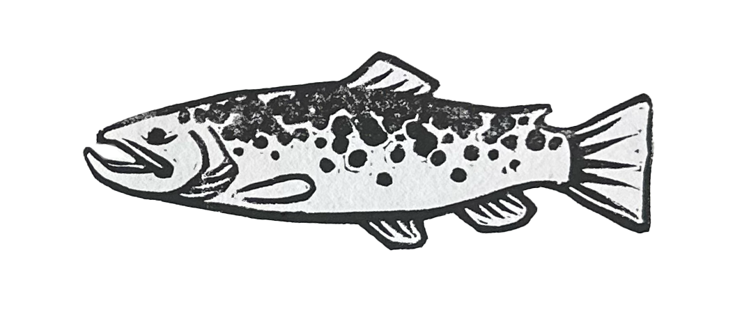
Black and white
The purpose of the US City Rebrand was to get experience creating a brand identity. This process taught me how to create a one sheet, and the importance of remaining consistent in branding across all platforms and products. Prior to this assignment, I was unaware how much could go into a branding guideline. One discovery I made was different color codes. I learned that it is best to start from a pantone and work your way down to a hex code, as there may not be an exact pantone for your hex code. Printing proved to be stressful and full of more unexpected surprises that I have ever encountered. It took me over three hours in the print lab to get it right. I found the most difficulty with getting colors to print correctly and getting pages to print double sided.
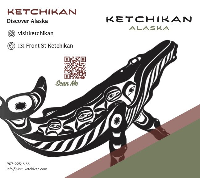
My design choices are a direct correlation of the history and culture of Ketchikan. Fishing and Native American culture are at the forefront of the community. I wanted to highlight this in my brand identity. Given the opportunity for revision, I would go through my branding and create patterning along with another usage guide with it. I feel as if this would tie in my identity and create cohesion through products. Overall, my colors and style are representative of the city and appropriate for Ketchikan.
Brochure


Stationary Package
Business Card


Letterhead

Envelope

Mood Boards


Design Process Sketches


