Magazine Reboot

The purpose of this assignment was to gain experience type setting something we are likely to encounter in our careers. One thing I emphasized was balance. At the beginning, the track was placed at the top of the page with little play around other elements. Through rounds of edits the track became engaged with the whole page. It began to cut around the text and wrap around the figure. I think this makes an interesting composition paired with the downsizing of the text. Scale was difficult for me, my original document was sized incorrectly causing my text to be size 18. This has since been reduced to size 10 and size 12.
I enjoy the colors and hierarchy achieved in this assignment. I used color to create implied hierarchy, such as the subheadings and introduction paragraph. Overall I enjoy the composition of the final outcome, and think that it creates an on brand and cohesive look. Printing was my biggest challenge and I learned about four color type as well as the importance of saving images in true grayscale. Adding a grey filter over an image does not make it a true gray scale. It was evident after looking through a magnifying glass that the image was being distorted as the printer attempted to add all layers of color.
.

Design Process

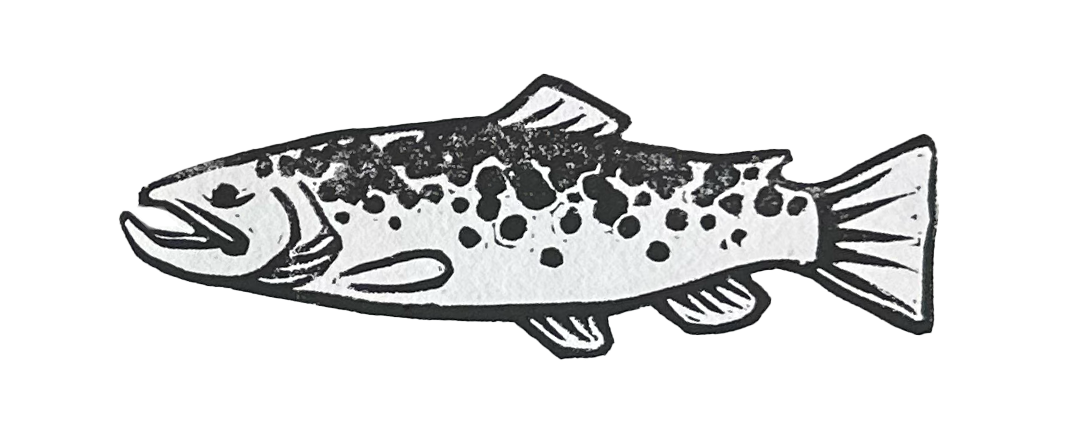
Design lacked movement and interest. Adjusted the track to move around the words and put the figure in gray scale to match the colors of the spread.